
As a visually oriented species, we grasp information much more quickly and easily when it’s presented as a picture than when we’re given lists of numbers. That’s why we find bar graphs and pie charts so useful. But often there are even better ways to visualize data.
I plan to use this blog post as a collection point for links to creative and effective data visualizations, and will add to it whenever I come across something interesting and relevant. If you happen across anything you think I should add, please let me know. I welcome suggestions.
Of course, Edward Tufte is a master of this field.
I’m also curious about any work that’s been done to create effective “visualizations” of data for the blind and visually impaired.
Time
A Perspective on Time, by Wait But Why
The Universe
Interactive Scale of the Universe – and – Scale of the Universe II
Tour of our stellar neighborhood (requires Chrome or other WebGL browser)
Planets, Sun, and Star Sizes Animated
Animation of all the asteroids around us we can’t see
Interactive 3D animation of asteroids
Travel through the solar system at the speed of light
If the moon were only 1 pixel: A tediously accurate scale model of the solar system
Visualization of the earth and its place in the universe
Powers of Ten – the classic short movie
Our Physical World
Lakes and Oceans Comparative Depth Diagram, by XKCD
How the Earth would look without oceans
Earth’s Water as a Sphere – and – Earth’s Water as a Cube, by Wait But Why
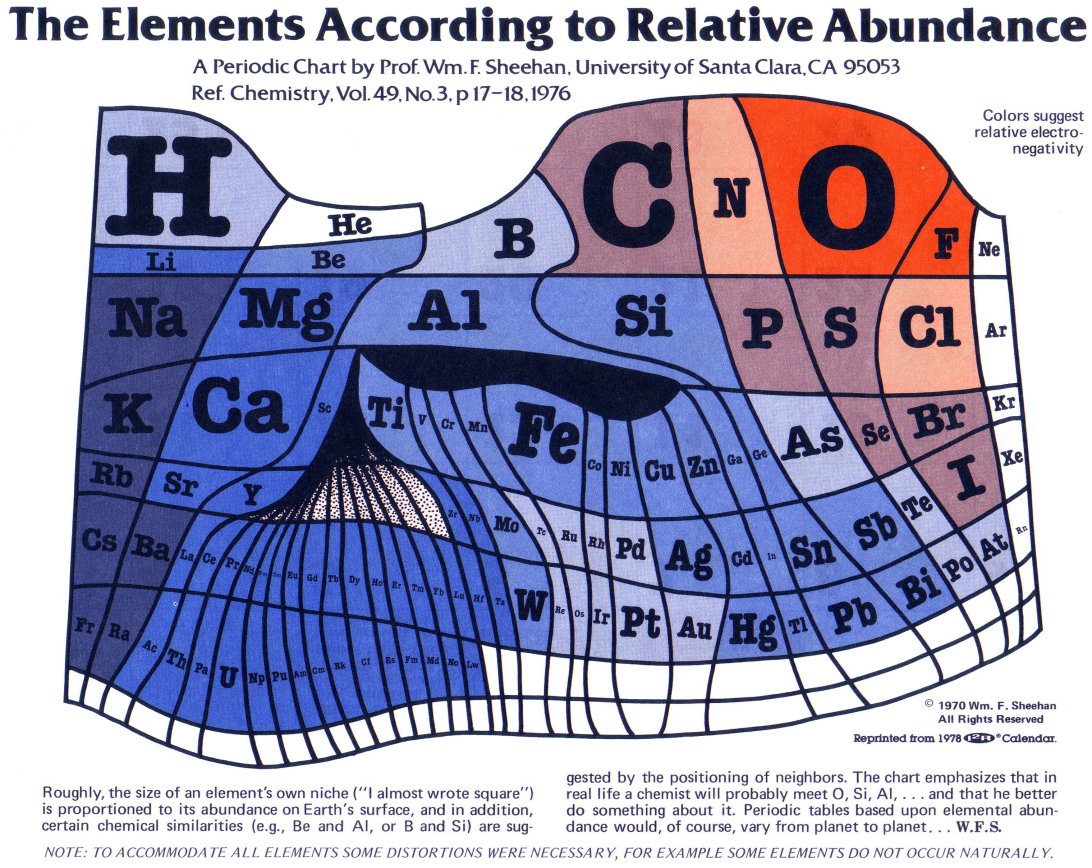
Periodic table of the elements stretched to show their abundance on the earth’s surface
Perpetual Ocean: Animated ocean currents, by NASA
Wind Currents in the U.S. – Nearly real time animation by Viegas & Wattenberg.
Lightning strikes in North America in real time
NOAA Weatherview – animated views of the globe
Animation of every recorded earthquake in sequence as they occurred from January 1, 2001, through December 31, 2015, at a rate of 30 days per second. Description of the video is here.
Dynamic, data-driven maps from National Atlas
Money
Money: A Chart of all of it, where it is, and what it can do, by XKCD
Visualization of United States debt
Visualizing Obama’s budget cuts using pennies
Income Inequality in the United States
Human Population
Population Density – Interactive Map by Derek Watkins
Migration in the United States – Interactive map.
The U.S. redrawn as 50 states with equal population
World Population History, 1 CE to 2050 CE
Animated map of religions spreading across the world, 3000 BCE to the present
Death
Causes of Untimely Death Worldwide
Traffic Fatalities in the United States
Historical Worldwide Death Toll Comparisons
Other Stuff
The OneZoom Tree of Life Explorer – Interactive map of evolution and species
Health Supplements: Interactive chart of scientific evidence by David McCandless
The changing American diet, 1970-2013
Real-time visualization of flights in progress world wide
Infographic of all active satellites orbiting the earth
Time Lapse Map of Nuclear Explosions
Dan Meyer’s Personal Annual Report, 2009 (video)
Sites with Many Visualizations
Derek Watson Map-based visualizations, including history of expansion of the U.S. by post offices, generic terms for streams, and others.
Global Incident Maps Near real-time maps showing earthquakes, disease outbreaks, HAZMAT situations, and other incidents.
Fernanda Viegas & Martin Wattenberg Many cultural and commercial design data visualizations. Flesh maps, phrase nets, color use, and more.
David McCandless – Information Is Beautiful
Comments
Creative Data Visualizations — No Comments